

Hey there! Today we are going to talk about some useful tricks in CSS. Let's begin with…
在这篇文章中我们会谈论一些有用的 CSS 技巧…
Blend Modes
混合模式
Not so far Firefox and Safari started to support blend modes right as Photoshop does. It also works in Chrome and Opera but with flags. See an example:
到目前为止,Firefox 和 Safari 已经能和 Photoshop 一样支持混合模式了,Chrome 和 Opera 也通过带私有标志(-webkit- & -o-)支持,看一个示例:
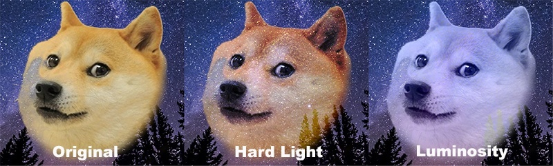
You can create different styles. Here's a code of what is going above:
你可以创建不同的混合风格。上述示例的代码如下:
.blend {
    background: #fff;
}
.blend img {
    mix-blend-mode: darken;
}
来试试混合模式和过滤
Gradient Borders
边框渐变
Novadays you can use gradients even in borders.
在边框中也能使用渐变效果了。
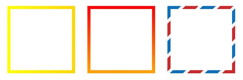
It is rather simple to use, just need to set pseudo-elements with lower z-index:
边框渐变的效果实现很简单,仅仅只需为伪元素设置更低的 z-index :
.box {
  margin: 80px 30px;
  width: 200px;
  height: 200px;
  position: relative;
  background: #fff;
  float: left;
}
.box:before {
      content: '';
      z-index: -1;
      position: absolute;
      width: 220px;
      height: 220px;
      top: -10px;
      left: -10px;
      background-image: linear-gradient(90deg, yellow, gold);
}
All examples you can find here. Also there is approach with background-clip and background-origin. Someday in the bright future border-image property will be supported by all browsers and solution for this will look as follow:
在这里能找到更多示例,另一种方法是通过 background-clip 和 background-origin 来实现。在未来的某一天,border-image 会被所有浏览器支持,其提供的边框渐变方式可能如下:
.box {
    border-image: linear-gradient(to bottom, #000000 0%, #FFFFFF 100%);
    border-image-slice: 1; /* set internal offset */
}
Transition for z-index
z-index 过渡
You may didn't know but z-index supports transitions too! It doesn't change it's value on each step so you think that it doesn't have a transition. But it does!
你可能不知道 z-index 也支持过渡效果!它没有在每一步改变它的值,所以你认为它没有过渡效果,但实际上是有的!
这有一个很棒的示例
currentColor
We can use it to detect the current color so we don't have to define it lots of times.
我们可以使用 currentColor 来检测元素当前使用的颜色,因而不需要定义 color 很多次。
It can be useful when working with SVG icons which change their color depending on their parents. Usually we do it as follows:
结合 SVG 图标使用时,currentColor 是很有用的,因为图标颜色的改变取决于它们的父元素。通常我们是这么做的:
.button {
  color: black;
}
.button:hover {
  color: red;
}
.button:active {
  color: green;
}

.button svg {
  fill: black;
}
.button:hover svg {
  fill: red;
}
.button:active svg {
  fill: green;
}
使用 currentColor 之后:
svg {
  fill: currentColor;
}

.button {
  color: black;
  border: 1px solid currentColor;
}
.button:hover {
  color: red;
}
.button:active {
  color: green;
}
另一种方式是用于伪元素:
a {
  color: #000;
}
a:hover {
  color: #333;
}
a:active {
  color: #666;
}

a:after,
a:hover:after,
a:active:after {
  background: currentColor;
  ...
}
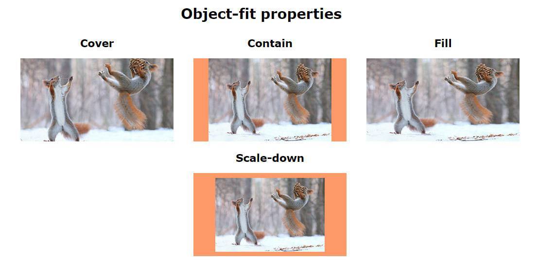
Object Fit
对象适配
Do you remember this moment when you wanted to set background-size for image because it will solve a lot of problems? Now you can use object-fit which is supported by webkit and will be added to Firefox soon.
你还记得通过设置图片的 background-size 属性可以解决很多问题的时刻吗?现在你可以使用 object-fit 了,它已经被 webkit 内核的浏览器支持,不久 Firefox 也会支持。
.image__contain {
  object-fit: contain;
}
.image__fill {
  object-fit: fill;
}
.image__cover {
  object-fit: cover;
}
.image__scale-down {
  object-fit: scale-down;
}
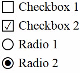
Checkbox and Radio Buttons Styles
复选框和单选按钮的样式
让我们不使用图片来改变复选框的样式:
 <input type="checkbox" id="check" name="check" />
 <label for="check">Checkbox</label>
input[type=checkbox] {display: none;}

input[type=checkbox] + label:before {
    content: "";
    border: 1px solid #000;
    font-size: 11px;
    line-height: 10px;
    margin: 0 5px 0 0;
    height: 10px;
    width: 10px;
    text-align: center;
    vertical-align: middle;
}

input[type=checkbox]:checked + label:before {
    content: "\2713";
}
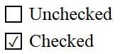
As you can see, it works with pseudo-elements and pseudo-selector :checked (IE9+). In the code above we hide original checkbox and show ours instead. When checked, we show a Unicode character using the content.
正如你看到的,需要结合使用伪元素和伪类选择器 :checked(IE9+)。在上面的代码中,隐藏了原始的复选框,显示它的替代元素。当复选框被选中时,通过使用 content 属性显示一个 Unicode 字符。
Note that the Unicode character in CSS differs from that in HTML. In CSS the number is specified in hexadecimal notation with trailing slash at the beginning, while in HTML it's decimal and will look like ✓.
需要注意的是 Unicode 字符在 CSS 和 HTML 中的表示是不同的。在 CSS 中,数字是被指定为以反斜杠开头的十六进制方式,而在 HTML 中是形如 ✓ 的十进制方式。
给复选框添加动画效果:
input[type=checkbox] + label:before {
    content: "\2713";
    color: transparent;
    transition: color ease .3s;
}
input[type=checkbox]:checked + label:before {
    color: #000;
给单选按钮添加动画效果:
input[type=radio] + label:before {
    content: "\26AB";
    border: 1px solid #000;
    border-radius: 50%;
    font-size: 0;
    transition: font-size ease .3s;
}
input[type=radio]:checked + label:before {
    font-size: 10px;
译者补充:
复选框的 CSS 魔法
利用checkbox实现 jQuery 的6中基本动画效果
Counters in CSS
CSS 计数器
并不是所有人都知道 CSS 可以用于计数:
<ol class="list">
    <li>a</li>
    <li>b</li>
    <li>c</li>
</ol>
.list {
    counter-reset: i; //reset conunter
}
.list > li {
    counter-increment: i; //counter ID
}
.list li:after {
    content: "[" counter(i) "]"; //print the result
}
We define a random ID in counter-reset property and it's first value (0 by default). You can set another number in counter-increment. It will define the step of your counter.
For example counter-increment: i 2 will displays only even numbers.
在 counter-reset 属性中,定义了一个随机 ID,其默认值是0。你可以在 counter-increment 属性中定义另外一个数字,作为计数的步长。
例如:counter-increment: i 2 将值显示偶数。
译者补充:详解content属性
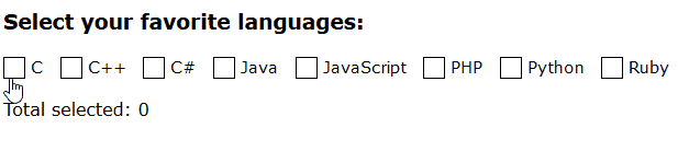
Advanced CSS Counters
CSS 计数器进阶
利用 CSS 计数器,能统计被用户选择的复选框个数:
<div class="languages">
  <input id="c" type="checkbox"><label for="c">C</label>
  <input id="C++" type="checkbox"><label for="C++">C++</label>
  <input id="C#" type="checkbox"><label for="C#">C#</label>
  <input id="Java" type="checkbox"><label for="Java">Java</label>
  <input id="JavaScript" type="checkbox"><label for="JavaScript">JavaScript</label>
  <input id="PHP" type="checkbox"><label for="PHP">PHP</label>
  <input id="Python" type="checkbox"><label for="Python">Python</label>
  <input id="Ruby" type="checkbox"><label for="Ruby">Ruby</label>
</div>
<p class="total">
  Total selected:
</p>
.languages {
  counter-reset: characters;
}
input:checked {
  counter-increment: characters;
}
.total:after {
  content: counter(characters);
}
在这个示例中,我们会增加 input:checked 的数量并打印出来。
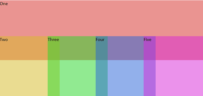
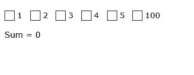
你还能创建一个小型计算器:
<div class="numbers">
  <input id="one" type="checkbox"><label for="one">1</label>
  <input id="two" type="checkbox"><label for="two">2</label>
  <input id="three" type="checkbox"><label for="three">3</label>
  <input id="four" type="checkbox"><label for="four">4</label>
  <input id="five" type="checkbox"><label for="five">5</label>
  <input id="one-hundred" type="checkbox"><label for="one-hundred">100</label>
</div>
<p class="sum">
  Sum
</p>
.numbers {
  counter-reset: sum;
}

#one:checked { counter-increment: sum 1; }
#two:checked { counter-increment: sum 2; }
#three:checked { counter-increment: sum 3; }
#four:checked { counter-increment: sum 4; }
#five:checked { counter-increment: sum 5; }
#one-hundred:checked { counter-increment: sum 100; }

.sum::after {
  content: '= ' counter(sum);
}
Menu Icon Without Images
没有图片的菜单图标
还记得你经常使用的汉堡包图标吗?
至少有三种关于怎么绘出这种图标的方法:
1、Shadows
 .shadow-icon {
   position: relative;
   }
   .shadow-icon:after {
     content: "";
     position: absolute;
     left: 0;
     top: -50px;
     height: 100%;
     width: 100%;
     box-shadow: 0 5px 0 #000, 0 15px 0 #fff, 0 25px 0 #000, 0 35px 0 #fff, 0 45px 0 #000;
     }
2、Gradient
.gradient-icon {
    background: linear-gradient(to bottom, #000 0%, #000 20%, transparent 20%, transparent 40%, #000 40%, #000 60%, transparent 60%, transparent 80%, #000 80%, #000 100%);
}
3、UTF-8
You can just paste this standard symbol: ☰ (Unicode: U+2630, HTML: ☰). You can adjust it's color or size only so it's not as flexible as other methods.
只需要粘贴图标的标准符号:☰(Unicode: U+2630,HTML: ☰),你可以调整它的颜色或大小,但它不如其它方法灵活。
可以看示例
此外,你也可以使用 SVG,icon font 或 borders 集合伪元素的方式来实现。
@Supports
There's a new expression in CSS called supports. As you can see, it can inspect whether browser supports needed option. Not all of browser support it, but you still can use it for simple checks:
CSS 中有一个被称为 supports 的新的表达式。正如你看到的,它能检测浏览器是否支持某属性。虽然并不是所有浏览器支持 @support 表达式,但你仍然可以使用它作一些简单的检测:
@supports (display: flex) {
    div { display: flex; }
}

/*You can check prefixes*/
@supports (display: -webkit-flex) or (display: -moz-flex) or (display: flex) {
    section {
        display: -webkit-flex;
        display: -moz-flex;
        display: flex;
        float: none;
    }
}
译者补充:An Introduction to CSS’s @supports Rule
visibility: visible
如果你将一个 visibility:visible 的块元素放在另一个 visibility:hidden 的元素中,会产生什么效果呢?
.hidden {
  visibility: hidden;
}
.hidden .visible {
  visibility: visible;
}
你可能会认为所有元素会被隐藏,但父元素会隐藏除了自身子元素以外的所有元素。看看这个demo
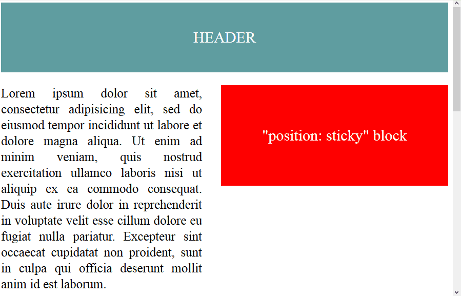
position: sticky
We've discovered a new feature that now you can create sticky blocks. They will be working the same as fixed blocks but won't hide another blocks. You'd better see it.
我们发现了一个新功能,现在你可以创建sticky块元素了。这和 fixed 块元素一样,但不同的是, sticky 块元素是不会遮挡另一个块元素的,最好看看demo
现在只有 Mozilla 和 Safari 支持这个属性,但你可以按照下面的方式使用这个属性:
.sticky {
  position: static;
  position: sticky;
  top: 0px;
}
We will get a sticky block in browsers which support it and a regular block in other programs. It is rather useful for mobile sites where you need to create a movable block which won't substitute others.
如果浏览器支持 sticky,则会得到一个 sticky 块元素,反之会得到一个普通的元素。当你在手机站需要创建一个可以移动的块元素而不会遮挡其它元素时是非常有用的。
(sticky可以看作是relative和fixed的结合)
New Dimensions
新的尺寸
Not so far this world discovered some new ways to describe sizes of different objects. Here are them:
- vw (viewport width) – one percent of browser window's width.
- vh (viewport height) – the same but for height.
- vmin and vmax choose minimal and maximal value between vh and vw.
现在有一些新的方式来描述不同对象的大小了,如下:
- vw(视口宽度): 1vw表示浏览器窗口宽度的1%
- vh(视口高度): 1vh表示浏览器窗口高度的1%
- vmin 和 vmax 表示视口高度和宽度两者中的最小值或最大值。
The interesting thing is that they all are great supported in most of modern browsers so you can freely use them.
有趣的是所有现代浏览器都支持它们,你可以自由使用。
Why do we need them? That's because they make all dimensions simpler. You don't have to specify percentage of parent's element size and any other stuff. Just have a look:
为什么需要它们?因为它们使得所有的尺寸计算变得简单了。你不需要指定父元素大小的百分比和任何其它的stuff。看代码:
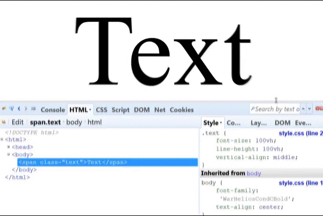
.some-text {
    font-size: 100vh;
    line-height: 100vh;
}
或许你可以在屏幕正中间放一个弹出效果了:
.blackSquare {
    background: black;
    position: fixed;
    height: 50vh;
    width: 50vw;
    left: 25vw;
    top: 25vh;
}
看起来是一个很酷的方式,看看Codepen上的示例
在使用这个功能时,也有一些要主要的事项:
- IE9 会使用vm,而不是vmin
- IOS 7 在使用vh时有一些Bug
- 浏览器对vmax的支持并不完全
译者补充:七个你可能不认识的 CSS 单位
Text Decorations
文本装饰
可以用下面几行代码改变被选中文本的颜色:
*::selection {
    color: #fff;
    background: #000;
}
*::-moz-selection {
    /*Only Firefox still needs a prefix*/
    color: #fff;
    background: #000;
}
除了定义 color,还能定义 shadow 和 backgrounds。
Block Scroll on Touch Devices
触摸设备上的块元素滚动
If you have some blocks with inner scroll in them then you have to add not only overflow: scroll / auto but this line also:
在触摸设备上,如果你有一些块元素在内部有滚动,则你不仅需要添加 overflow: scroll / auto,还要添加:
-webkit-overflow-scrolling: touch;
The thing is that mobile browser sometimes don't work with overflow: scroll property correctly and scroll all the page instead of the needed block. -webkit-overflow-scrolling fix this issue. You can see it by adding this to your own project.
这种情况是有时设置了 overflow: scroll,移动端的浏览器会滚动整个页面而不是在需要的块元素中滚动。-webkit-overflow-scrolling 修复了这个问题。你可以把它添加到你的项目中看看效果。
Using Hardware Acceleration
使用硬件加速
Sometimes your animation can to slow down client's computer. You can use acceleration for special block in order to prevent this event:
有时,你的动画效果在客户端的计算机上会减慢,为了防止这种情况发生,你可以为特定的块元素使用加速:
.block {
    transform: translateZ(0);
}
In statics you won't notice any difference, but browsers will understands that the element should be treated as three-dimensional and will enable acceleration. Until there are no normal support of specifically designed for this property will-change, this method is quite descend.
在静态情况下你可以不会注意到差别,但浏览器会认为这个元素应该被视为 3D 元素并能够加速。在属性 will-change 没有得到正常支持之前,这种方法是很有用的。
Unicode Classes
Unicode 类
现在可以用 Unicode 符号来设置类名:
.❤ {
    ...
}
.☢ {
    ...
}
.☭ {
    ...
}
.★ {
    ...
}
.☯ {
    ...
}
不要在大项目中使用,因为 UTF-8 可能并不被所有计算支持。
Vertical Margines in Percents
在垂直 Margins 上使用百分比
事实上,垂直缩进是根据父元素的宽而不是高来计算的,我们创建两个块元素:
<div class="parent">
    <div class="child"></div>
</div>
.parent {
    height: 400px;
    width: 200px;
}
.child {
    height: 50%;
    padding-top: 25%;
    padding-bottom: 25%;
    width: 100%;
}
理论上,应该按父元素的高来填充,但是我们得到的效果是相反的:
你应该时刻记住百分比是按照父元素的宽计算的。
译者补充:CSS 中的百分比
Margins in Firefox Buttons
Firefox的按钮的Margins计算
对于按钮的margins计算,Firefox有它自己的方式。
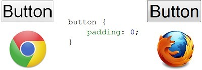
可以使用下面的方式修复:
button::-moz-focus-inner,
input[type="reset"]::-moz-focus-inner,
input[type="button"]::-moz-focus-inner,
input[type="submit"]::-moz-focus-inner {
    border: none;
    padding:0;
}
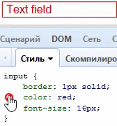
Color + Border = Border-Color
并不是所有人知道,通过定义任何对象的文本颜色,也能定义其边框色:
input[type="text"] {
    color: red;
    border: 1px solid;
}
Bonus for Oldies
如果你还要支持 IE7 或其他低版本浏览器,你可以用一个smile来定义它们的 Hacks,就像这样:
body {
    :) background: pink;
}
扫码二维码 获取免费视频学习资料

- 本文固定链接: http://www.phpxs.com/post/4642/
- 转载请注明:转载必须在正文中标注并保留原文链接
- 扫码: 扫上方二维码获取免费视频资料